Case Notes
- Website redesign
- Client | Standard Goods Inc.
- Role: UX, UI, Graphic Designer, Art Director, Front End Coder
- Duration | 1.5 years
Project Goals
Ramping up to redesign and reconfigure an eccomerce website through the midst of the pandemic. This project involved wearing multiple hats, diving into unique and ever changing client needs, and problem solving with extremely limited budget.
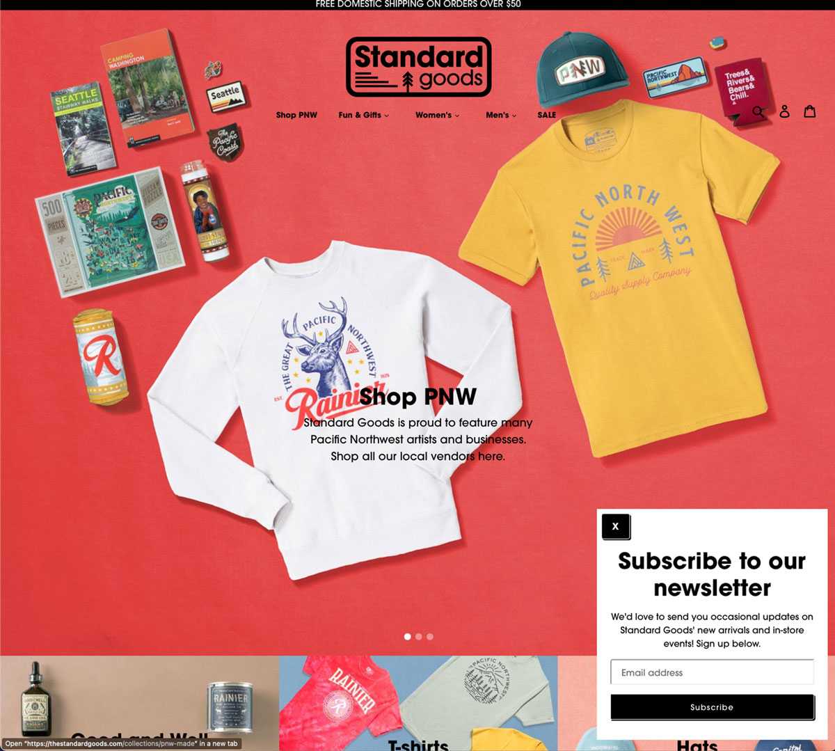
The initial state of the site
During covid lockdown many small businesses that focused on brick and mortar locations were left struggling to adapt. In many cases their online presence was almost completely ignored. I was in contact to do some basic consulting. Initially the focus was on simple changes that could be made to improve the experience.

First Prototype
In looking at a quick turnaround, I focused on adding more enticing product collections. Many of the best selling products had no easy way to find and I felt the faster a customer can find what they historically like to buy on the site would be a good start. Second the unnecessary size of the header was still a personal preference to the owner so as a compromise I added a "sticky" header or a navigation that would collapse and take up less real room on the page.

Organization
The next large hurdle to tackle was the organization within the product backend. Shopify unfortunately, doesn't ship with a default way to create hierarchies. This is difficult in this use case as there are hundreds of products which are either seasonal or one time entries. The goal ideally is to give customers an easier time finding what they're currently interested in. As an example apparel and outerwear could be considered two seperate categories, and products should automatically be added to each without much difficulty.
Organization methods
I broke down the information from a customer perspective. Tallying the amount of products and grouping in three factors, customer testing and records, second internal needs, and third, the quantities. This simple process is much more complicated in Shopify without a built in way to build it hierarchy. In my research the most common workaround was to add an underscore to tags which you could then use for grouping products (e.i. "_tag") while excluding them from client side filters. We also needed this to be versatile in that multiple combinations needed to exist. The next step in the process was combing through the database output into a csv file and replacing all the 7,000 plus entries with new tags. I then spent weeks in review with stakeholders in the process as well as running multiple dry runs on a developer account before overwriting the database.


Documentation examples for internal use


Results of Tagging and Filtering
The intended function was is to utilize filtering and categories without adding unnecessary complications on the users.
Visual Design | Samples
- Branding
- Emails
- Signage
- Site and logo
Design Direction
Standard goods has maintained a mix of an industrial and kitsch aesthetic. There is a mix of fashionable clothing, graphic tees, and a good deal of pop culture tchotchkes. A major constraint is also cost. So the design has a distinct diy with retro vibes, combining the use of texture, a photocopy look to imagery, as well as a late 70s modernist aesthetic.


Logo redesign
Early on in the project I started to plan for an eventual refresh of the logo to go with the branding. Wanted to focus on adding more personality into the direction. Considering more of what the type of products being sold were more about focused around the Pacific Northwest. A theme organically came through in the design process and focused around mountains, sea, and trees.
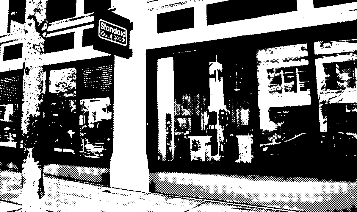
Signage
Shortly after reworking the logo, I found out the store location was going to be moving. This was an excellent time to have new signage made. I had made a few mockups so that I would be able to ensure good communication with different vendors on the the type of signs we hoped to have made.


Photography Direction
Ideally we would have had models for our editorial to help customers feel connected to the brand. During covid it was not going to be feasible to have models and keep a consistent look. Ultimately we needed to accept the limitations within the space to for photography. I focused on the silhouette of the products and utilizing a more graphic appearance constant with a "diy" look.


