Case Notes
- Website redesign
- Client | Days For Girls
- Role: UX researcher
- Duration | 3 weeks
Project Goals
Days for Girls is a non-profit which distributes reusable feminine hygiene materials for women in need around the world. Our Goal was to evaluate the site through research and to offer recommendations in the form of information architecture, wireframes, and mockups to redesign their site.

Research Methods
General Research
What are the primary motivators for people to donate online
What prevents people from donating online
Trends in age, or groups that might provide insights
Site readability and conversion statistics


Analytics Research
Focus on in analytics
- Trends
- Conversion rates
- Behaviours and flows
- Page views
- Trends
- Conversion rates
- Behaviours and flows
- Page views
.png")
Analytics Insights
- It’s not clear when the donation button is clicked
- Low organic conversion rate
- High traffic to portals within dfg site from the home page from returning visitors who are looking for sewing patterns
- Site search would also be valuable to attach to analytics

Competitive analysis
Other than page speeds, Dfg site was not missing significant features that would put them at a disadvantage.


Key things to test
Landing Page / Clarity of message
Is it easy to donate
How easy is it for a new user to find out how to volunteer
User testing - comparing sites
Based on the research findings we set up three tasks comparing Dfg with two other sites.
- Firstly, we’d like you to tell us what the organization does. (You should be able to know after 15 seconds)
- Secondly, we’d like you to find where you can make a donation.
- Lastly, we’d like you to volunteer. Find where you can volunteer from the home page, find a local group and sign up.
The Tasks

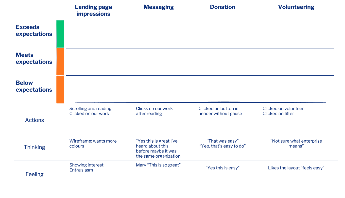
User Journey
To convey the qualitative states in the user testing I created this journey map to visualize and condense what I had observed

Information Architecture
Melissa began with an inventory of the existing site architecture.
There was a lot of complexity in the navigation and from the research it was a reason for confusion in users who tested the site.

Research findings
- Based on comparative testing the landing page could be more scannable.
- Volunteering was confusing.
- Users found the Navigation to be complex and had difficulty choosing.
It would be useful to have more research through surveys and interviews with current donors.

Initial sketches
With the research and card sort information, Keriann began blocking out the key pages we would focus our efforts on.

Wireframes
Based on the initial sketches Keriann then created wireframes we and a prototype I could start testing with.

User Testing
With the initial prototype ready for testing I sent out a screening survey to find out more about donation trends and to see who might be wiling to participate in testing our design
User Testing Results
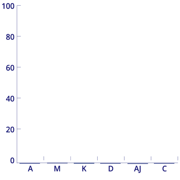
In a quick turnaround of 3 days I was lucky to arrange testing sessions with 6 volunteers on 3 tasks in our prototype
I used a System Usability Scale (SUS) to quantify the results
After the first 2 tests Keriann was able to make some quick iterations, which in the last participant gave a score of 100
User Journey Map
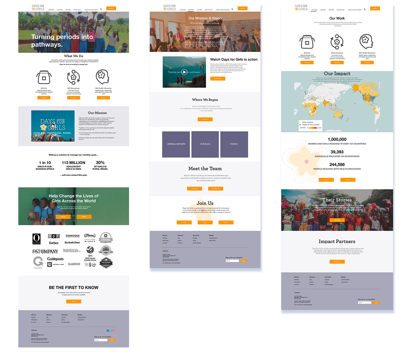
Final Mockups